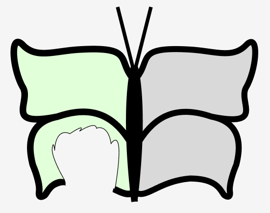
At first glance, our masthead logo may seem simple, but it holds a tale of balance and creativity. The green torn left wing, resembling an inverted “R,” and the smooth blue right wing, reminiscent of a “B,” create a subtle contrast that quietly speaks volumes.
The torn green wing, marked by jagged edges and vibrant hues, suggests movement and resilience. Far from perfection, the tear along its edge becomes a distinctive feature, symbolizing the brand’s embrace of imperfections as part of its identity.
On the other side, the smooth blue wing imparts a sense of calm and stability. The choice of blue, a colour associated with trust, subtly communicates with viewers on a subconscious level. Together, these wings form a balanced representation, showcasing the brand’s blend of vibrancy and stability.
The colour palette, featuring a pastel green and a soothing blue, enhances the overall aesthetic and reinforces the brand’su identity. The deliberate selection of hues reflects an effort to evoke specific emotions, enriching the viewer’s experience.
In conclusion, my masthead logo, with its torn green and smooth blue wings forming the ‘R’ and ‘B,’ is a quietly intriguing symbol of our brand’s identity and values. It captures attention while encouraging viewers to uncover the layers of meaning within its design.
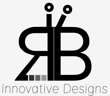
My second masthead logo, a creative blend of an inverted ‘R’ and the letter ‘B’ are also stylized as a butterfly, subtly weaves a narrative of our brand’s identity. Let’s take a closer look at the unassuming details that make this design unique.
The butterfly-inspired formation, where the inverted ‘R’ seamlessly integrates with the ‘B,’ brings a touch of creativity to the logo. The negative space within the overlapping letters forms the butterfly’s body and introduces an innovative dash line. Placed over the gap in the ‘R,’ this dashed line progressively becomes more transparent, subtly hinting at the brand’s adaptability and forward-thinking approach. The transparency suggests an openness to change and evolution.
Beneath the butterfly wings, the slim handwriting reads ‘Innovative Designs’ in a sans-serif typeface. Placed unobtrusively, this tagline conveys a sense of sophistication, inviting viewers to explore the relationship between the visual elements and the brand’s core values. The sans-serif typeface adds a touch of modernity and simplicity to the overall design, ensuring that the words complement rather than overshadow the central logo.
On top of the butterfly wings, two antennae emerge – one facing straight and the other slightly crooked. These antennae not only complete the butterfly motif but also introduce a playful asymmetry. The straight and crooked antennae symbolize the harmony between order and spontaneity inherent in innovative designs. It reflects the idea that creativity thrives on a blend of structure and a touch of individuality.
In conclusion, our masthead logo, with its butterfly-inspired design, encapsulates the brand’s commitment to innovation. The intertwining ‘R’ and ‘B,’ the evolving transparency in the dashed line, the sans-serif typeface in the tagline, and the delicate antennae together tell a story of adaptability, creativity, and a willingness to embrace change. As the butterfly takes flight, so does our dedication to innovative designs that push boundaries and inspire evolution.