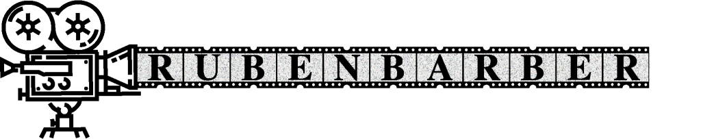
In crafting my personal logo, I aimed for a blend of class and cinematic vibes. The spotlight of this design is a fancy 2D illustration of a movie projector, a symbol that screams storytelling and creativity. What makes this logo special is the film rolling out of the projector, each frame displaying a letter from my name. I used a fancy font to keep it classy and a bit posh.
The letters on the film keep that classy vibe, while the moving frames add a lively touch. It’s like a mix of elegance and motion, creating an interesting visual story. The contrast between the fancy font and the animated film frames gives the logo a cool and unique feel. To make it feel more like an old movie, I added a subtle film grain background. It’s a small touch that brings in a bit of nostalgia, connecting the classic typography with the movie theme.
This logo isn’t just a visual thing; it’s a nod to timeless style and the movies. It speaks to my love for classic fonts and the enduring charm of storytelling. In a world filled with logos, mine stands out as a mix of fancy and cinematic, inviting a peek into a space where classic and cool collide in a simple but expressive way.
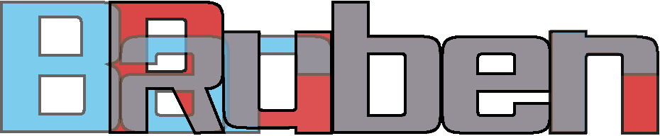
In the pursuit of a captivating visual identity, I embarked on a design journey that unfolded in layers of colour and creativity. Inspired by the alignment of ‘Ruben’ and ‘Barber,’ I delved into a red and blue colour scheme, playing with opacity to create a 3D effect.
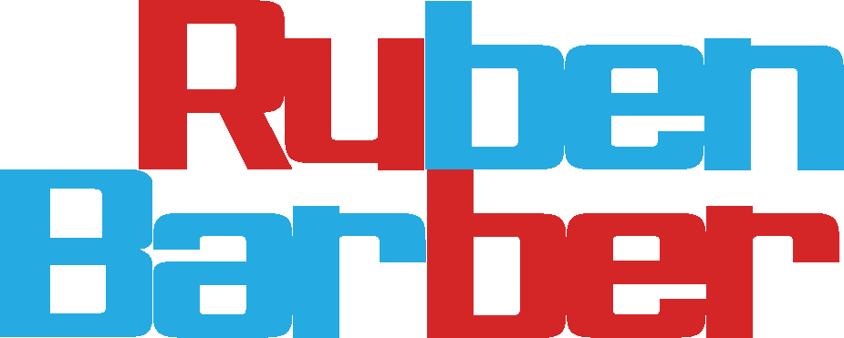
Initially, I experimented by overlaying ‘Ruben’ over ‘Barber,’ capitalizing on the perfect alignment of ‘ben’ and ‘ber.’ The play of red and blue, subtly dancing in and out of each other, created a mesmerizing depth. The overlapping letters seemed to reach out, hinting at a three-dimensional space within my name. However, in the pursuit of artistry, I discovered the importance of clarity. The overlapping design, while visually intriguing, posed a readability challenge. To address this, I decided to separate ‘Ruben’ and ‘Barber,’ assigning a vibrant red to ‘Ru’ and ‘be’ and a cool blue to ‘Bar’ and ‘ben.’
This redesign not only enhanced legibility but also allowed each segment to shine independently. ‘Ru’ and ‘ben’ embraced the warmth of red, while ‘Bar’ and ‘ber’ coolly bathed in shades of blue. The dynamic interplay of colours not only reflected my vibrant personality but also added a visual punch to my name.
To accentuate the 3D effect, I continued playing with opacity, allowing the colours to blend and overlap organically. The final result was a harmonious dance of red and blue, creating depth and dimension in a way that was both visually striking and easy to read.
In the realm of personal branding, this journey symbolizes more than just colours and letters. It’s a testament to the creative process—where experimentation leads to discovery, and the final design embodies both aesthetic appeal and practical readability. My red and blue name logo stands as a vibrant representation, capturing the essence of dynamic depth within a palette of colours.