The effective use of Typography can significantly impact a game’s overall experience, as we’ll explore in the context of one of the most iconic titles in the gaming industry: Doom Eternal. Developed by id Software and published by Bethesda, Doom Eternal brings an adrenaline-pumping, demon-slaying experience that’s further intensified by the clever use of typography.
Typography as a Mood Setter:
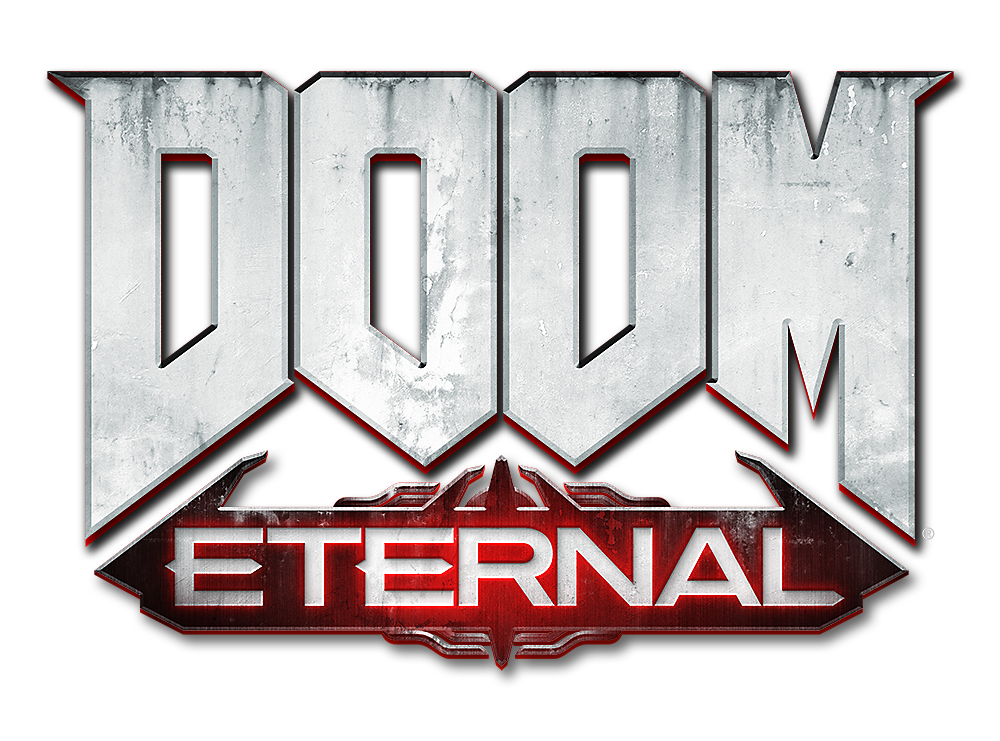
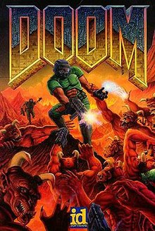
Typography plays a crucial role in setting the mood and atmosphere of a video game. In Doom Eternal, the dark and foreboding atmosphere is established right from the start, and typography is a significant contributor to this mood. The game’s title logo itself is a masterclass in typography. The letters in “DOOM” are bold and rugged, resembling stone or metal, mirroring the brutal and relentless nature of the gameplay. The choice of colour, a fiery red, adds to the sense of danger and urgency, preparing players for the intense action that awaits.
https://gamecardsdirect.com/de-de/nachrichten/doom-eternal-2020/
Creating Immersive UI Elements:
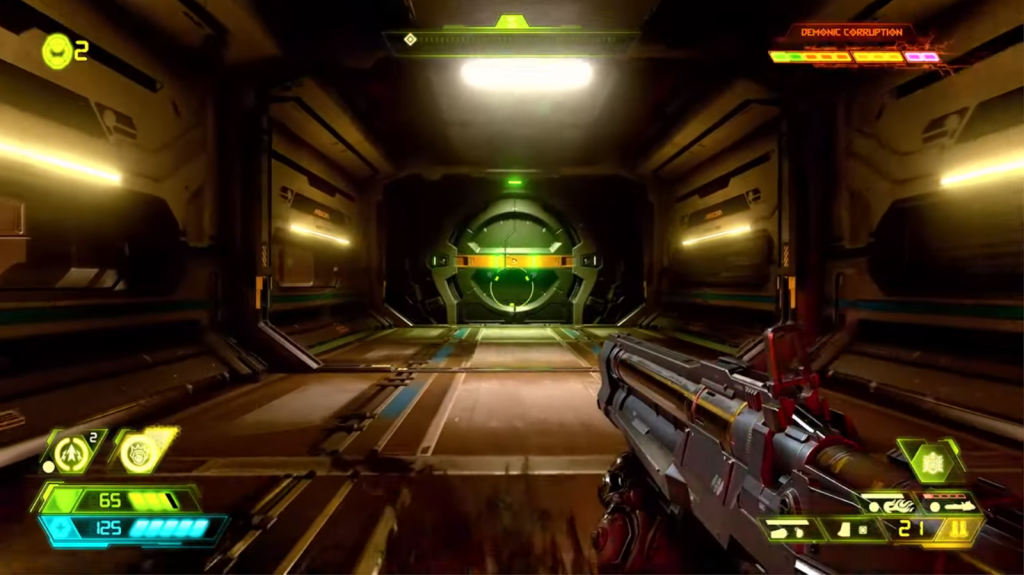
User Interface (UI) elements in games are often overlooked, but Doom Eternal understands the importance of typography in crafting a seamless and immersive user experience. The game’s UI features a mix of bold, blocky fonts that are easy to read and suit the game’s fast-paced nature. The fonts used for weapon and equipment descriptions are not just functional but also contribute to the game’s overall visual style.
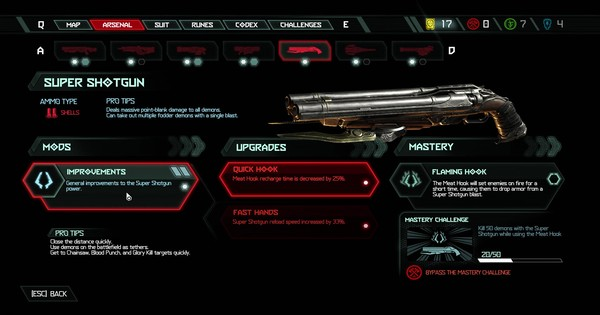
For example, the font used for weapon names is reminiscent of industrial machinery, reinforcing the idea that you’re a futuristic space marine armed to the teeth against hordes of demonic creatures. This consistent use of typography in the UI keeps players in the zone, never detracting from the action with confusing or jarring text elements.
Storytelling through Typography:
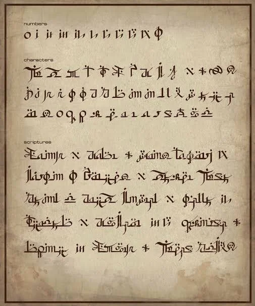
Doom Eternal also employs typography as a storytelling device, providing information and lore through various text-based assets. Codex entries, found throughout the game, are an excellent example. The fonts used in these entries vary to reflect the origin and significance of the content. For instance, texts related to demonic incantations use intricate and chaotic fonts, emphasizing their chaotic and malevolent nature. In contrast, texts related to the UAC (Union Aerospace Corporation) are presented in a cleaner and more corporate typeface, highlighting the bureaucratic side of the story.
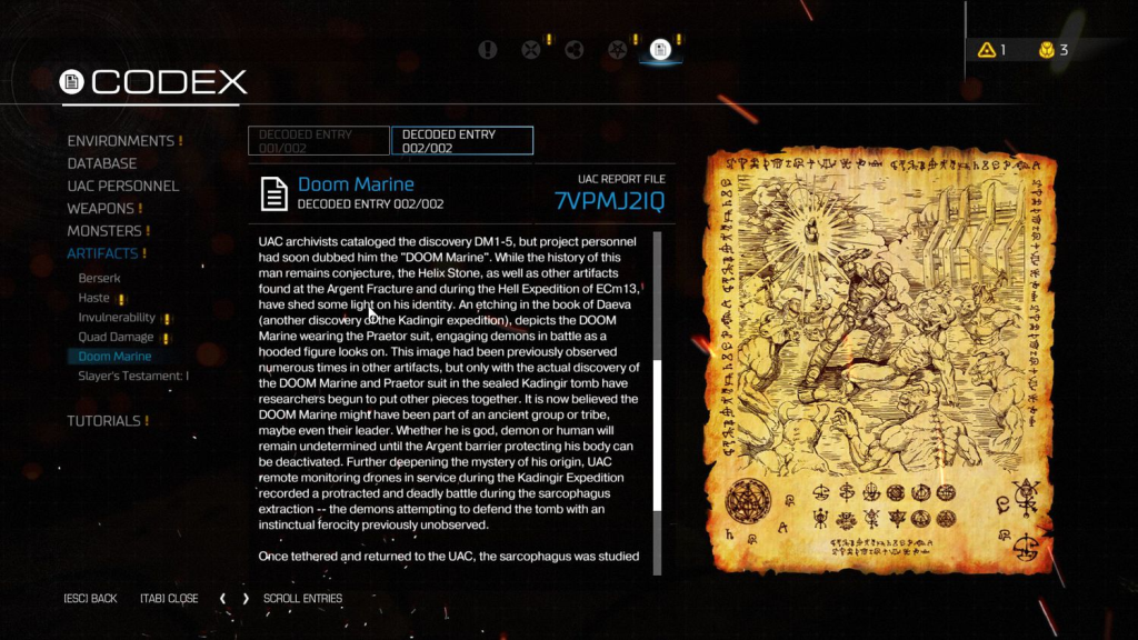
Moreover, the ancient text-like fonts used in various inscriptions and runes create a sense of mystery and otherworldliness, adding depth to the game’s lore. Players who take the time to read these entries are rewarded with a deeper understanding of the game’s world and its characters.
https://doom.fandom.com/wiki/Codex/Book_of_the_Seraphs
Consistency in Branding:
Typography also plays a significant role in branding Doom Eternal. The iconic “Slayer’s Testament” logo, with its bold, heavy metal-inspired typeface, is a perfect example. This logo appears not only in the game but across promotional materials, merchandise, and more. It serves as a symbol of the franchise and communicates the game’s intensity and heavy metal influences to fans.
Accessibility and Readability:
In a fast-paced first-person shooter like Doom Eternal, where every second counts, readability is of utmost importance. The choice of fonts and font sizes is crucial to ensure that important information is easily accessible during gameplay. Doom Eternal excels in this aspect, using fonts that are legible even in the heat of battle, making sure players can quickly understand vital information such as their health, ammo, and objectives.
Conclusion:
Doom Eternal is a prime example of how Typography can enhance the overall gaming experience. From setting the mood and atmosphere to providing information, storytelling, and creating a brand identity, Typography is a powerful tool that shouldn’t be underestimated in the design of video games. By effectively utilizing typography, Doom Eternal immerses players in its world of demon-slaying mayhem, enhancing both the gameplay and the overall experience. It’s a testament to how every element of design, including Typography, can contribute to making a game a memorable and immersive adventure.
Bad Example:
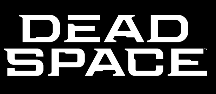
The Dead Space logo, in its original form, is a rather lackluster representation of the game’s immersive and futuristic setting. It employs a standard sans-serif font, and the design elements are minimal. The white letters lack depth and innovation, failing to convey the eerie, otherworldly ambiance of the game’s narrative.
https://en.m.wikipedia.org/wiki/File:Dead_Space_logo_%282023%29.svg
What Went Wrong?
Without any visual cues to the game’s futuristic setting or horror-filled narrative, the original logo falls flat, missing a golden opportunity to intrigue potential players. In the competitive realm of gaming, where visuals play a vital role in attracting audiences, the original Dead Space logo serves as a prime example of a missed opportunity to create a lasting and impactful first impression.
Improvements with theme:
To rectify this, I gave the logo a much-needed overhaul. The aim was to infuse a sense of futurism and dread into the typography. I started by merging some of the letters together, creating a unique, interconnected look. This subtle yet impactful change symbolizes the interconnectedness of technology and terror in the game’s narrative.
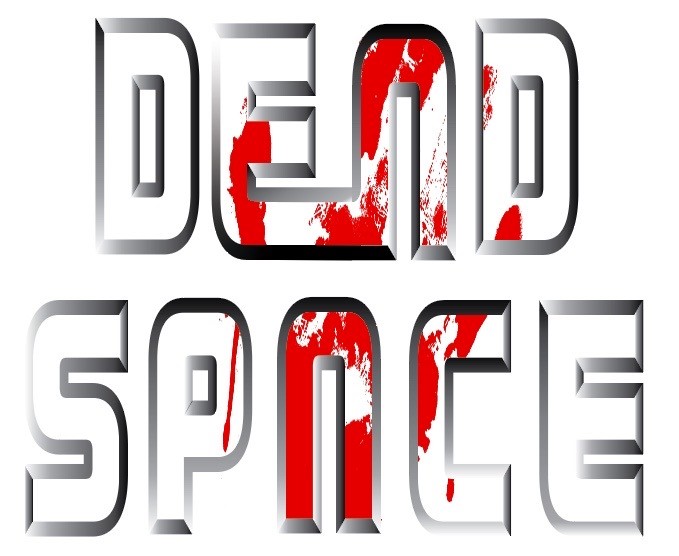
Next, I added a metallic bevel to the letters, transforming the dull white text into a three-dimensional, metallic masterpiece. The metallic sheen not only signifies the advanced technology in the game but also adds a much-needed futuristic touch.
But the transformation didn’t end there. I introduced a chilling element that Dead Space fans would instantly recognize—a bloody handprint. Placed strategically to cover only the white letters in the middle, the handprint brings a sense of unease and foreshadows the horrors players are about to face. This subtle yet bold detail embodies the core essence of Dead Space.
Conclusion:
The revamped logo now encapsulates the game’s futuristic and terrifying atmosphere. It’s a typographical masterpiece that not only reflects the narrative but also entices players with its enigmatic charm. By merging letters, adding a metallic bevel, and incorporating the iconic handprint, we’ve breathed new life into the Dead Space logo, making it a more compelling and evocative representation of the game’s dark and immersive universe.