The iconic Minecraft logo is a masterpiece of design, embodying the essence of the game and its creative potential. In a world where simplicity and creativity collide, the Minecraft logo perfectly encapsulates the core concept of this beloved sandbox game.
https://www.zenbusiness.com/blog/minecraft-logo/
Bold Simplicity:
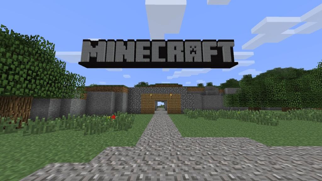
At first glance, the Minecraft logo may seem deceptively simple, but its minimalistic design is its strength. The blocky letterforms symbolize the building blocks that are at the heart of the game. These blocks are not just a design element; they are the very foundation upon which players craft their worlds, adventures, and stories. The simplicity of the logo reflects the game’s open-ended, limitless possibilities.
Pixel Art Inspiration:
Minecraft’s visual aesthetic is characterized by pixel art, a style reminiscent of early video games. The logo cleverly draws inspiration from this aesthetic with its blocky letters. This connection between the logo and the in-game visuals helps solidify the game’s identity, making it instantly recognizable to both players and non-players alike.
https://logo.com/blog/minecraft-logo
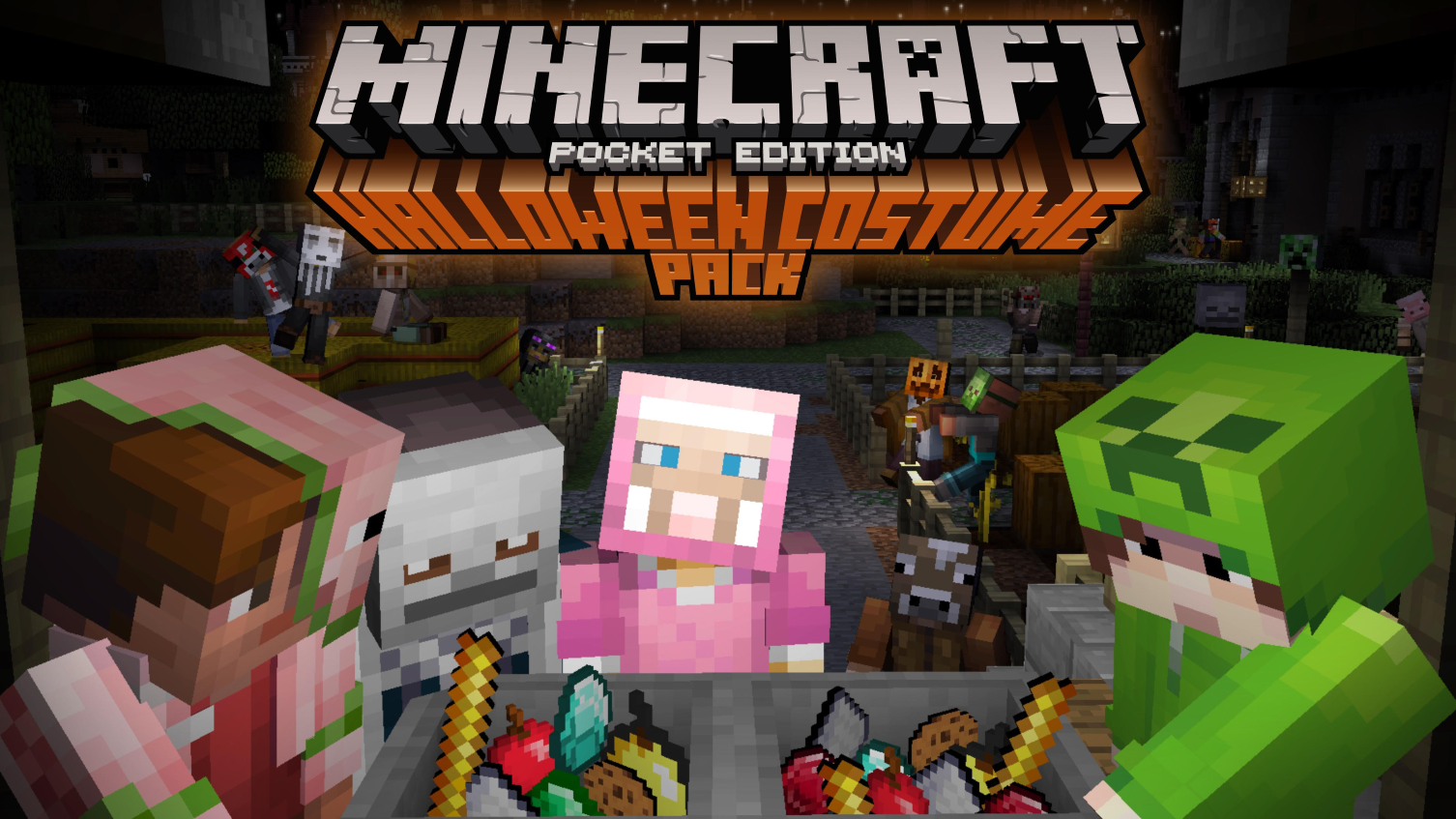
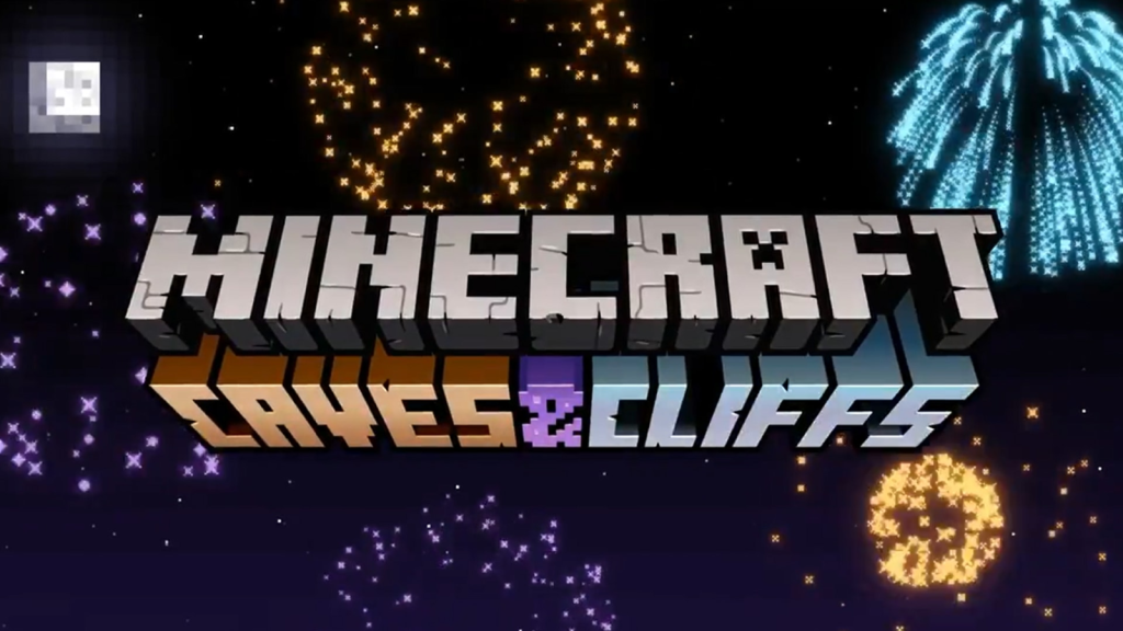
Versatility:
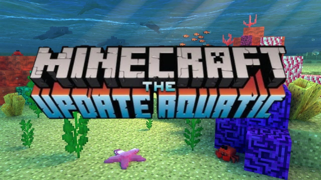
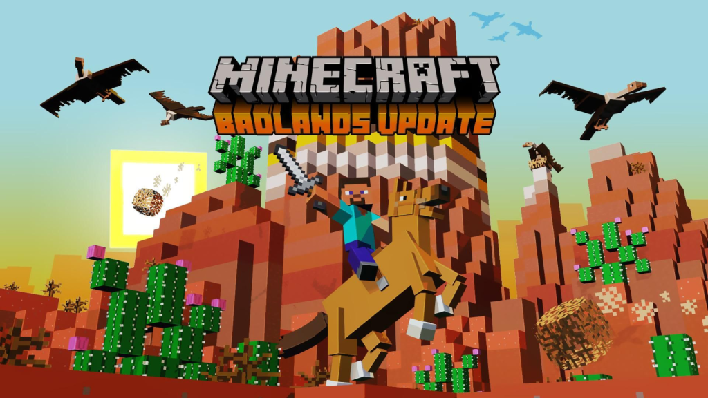
The Minecraft logo isn’t just a static image; it’s an adaptable brand mark. This flexibility allows it to seamlessly integrate with various themes, updates, and merchandise. Whether it’s Halloween-themed, aquatic, or related to any in-game event, the logo can be creatively altered to fit the occasion while maintaining its core design.
https://www.sportskeeda.com/minecraft/best-minecraft-update-ideas-fans-want-next
https://wccftech.com/minecraft-switch-patch-1-5-update-available/
https://www.bbc.co.uk/newsround/56761332
https://www.minecraft.net/en-us/marketplace/pdp?id=1d801b54-38aa-4ec0-bbf4-311a40d30268
Evoking Nostalgia:
For many players, Minecraft is more than just a game; it’s a nostalgic journey back to simpler times in gaming. The logo invokes a sense of nostalgia for the days of 8-bit and 16-bit gaming, resonating with players who appreciate the charm of retro visuals while enjoying modern gameplay features.
Conclusion:
In conclusion, the Minecraft logo is an exemplary model of how conceptual design can effectively encapsulate the spirit of a game. Its bold simplicity, adaptability, nostalgic charm, global appeal, and its unique connection to a dedicated player base all contribute to making it one of the most iconic and well-designed logos in the gaming world. It’s a testament to the idea that a logo is more than just an image; it’s a representation of a world waiting to be created and explored.
Bad Example
Forza Horizon, the beloved racing franchise, has a logo that needs a boost to match the speed and excitement it represents. The original design falls short of conveying the dynamic essence of the game, prompting a conceptual overhaul. In this blog post, i’ll delve into the journey of improving the Forza Horizon logo, which now better embodies the thrill of high-speed racing.
https://commons.wikimedia.org/wiki/File:Forza_Horizon_logo.svg
What changes need to be made?
The most prominent change in the redesign was transforming one of the ‘o’s in the word ‘Horizon’ into a speedometer, injecting an immediate sense of velocity and automotive energy. This clever modification served as a visual cue, signaling the very core of the game – fast cars, and thrilling races. The speedometer’s circular form added visual interest, making it an integral part of the logo’s composition.
Beneath the logo, a road was introduced, beginning just under the ‘Forza’ text and extending below. This ingenious adjustment made the letter ‘i’ in ‘Horizon’ function as road markings, creating an illusion that seamlessly connects the speedometer ‘o’ with the road itself. This concept masterfully ties together the entire logo, suggesting that Forza Horizon is where speed and road converge.
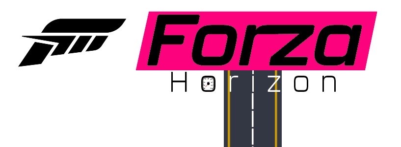
Accessibility changes:
To ensure readability and visual clarity, the letters overlapping the road were rendered in white, ensuring they stood out against the black background. This deliberate contrast accentuates the idea of a road stretching into the distance and invites players to embark on an exhilarating journey.
The inclusion of the iconic pink parallelogram around the ‘Forza’ text maintained a subtle nod to the franchise’s heritage, striking a balance between the old and the new.
Conclusion:
In summary, the redesigned Forza Horizon logo successfully combines form and function, representing the heart-pounding action of the game. By incorporating a speedometer, introducing a dynamic road motif, and enhancing legibility through color contrast, the emblem now truly encapsulates the excitement of Forza Horizon’s high-speed races. The outcome is a visually stimulating and conceptually rich logo that perfectly encapsulates the fast-paced spirit of the game.