In the world of graphic design, sometimes the most powerful statements are made through simplicity (https://visme.co/blog/graphic-design-tips/). The “Portal” logo, representing the celebrated puzzle-platform game developed by Valve Corporation, is a prime example of how effective composition can transform a design into a timeless emblem.
Simplicity that Speaks Volumes:
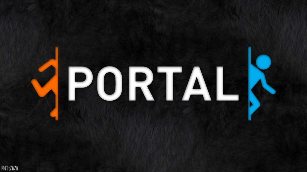
The “Portal” logo is a masterpiece of minimalism. At first glance, it may seem deceptively simple. The logo features the word “Portal” with a portal from the game on the side of the letters. The beauty lies in its uncomplicated design, making it not just easy on the eye but also a memorable symbol of the game.
Clarity and Visibility:
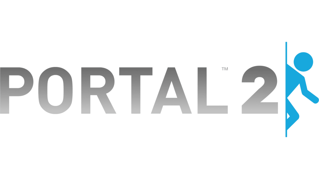
One of the logo’s key strengths is its clarity. The bold, grey text stands boldly against a pristine white background, creating high contrast for optimal readability. Whether viewed from afar or up close, the “Portal” logo is unmistakably clear. The font choice is crucial—the sleek, modern, sans-serif style mirrors the game’s high-tech aesthetic, instantly conveying its essence.
Thematic Relevance:
The “Portal” logo is not just a collection of letters; it is a portal in itself. This thematic relevance is what sets it apart. The blue person coming out of the portal references the portals featured prominently in the game. This connection bridges the gap between the logo and the core gameplay mechanic, where players manipulate portals to navigate intricate puzzles. It’s a powerful way to convey the essence of the game through design.
https://freebiesupply.com/logos/portal-2-logo/

https://images.app.goo.gl/MX62uMAsQsk4UhVJA
Harmonious Balance:
The composition of the logo is impeccable. “Portal” is centred within the circular shape, creating a sense of equilibrium. This balance doesn’t just make the logo visually appealing; it instils feelings of reliability and trustworthiness, characteristics sought after in gaming experiences. This mirrors the in-game company that tries to lure you in with false trust.
Conclusion:
In conclusion, the “Portal” logo is a testament to the power of effective composition. Its simplicity, clarity, thematic resonance, and harmonious balance create a logo that not only encapsulates the game’s essence but also stands as an iconic symbol of gaming. In the world of graphic design, the “Portal” logo reminds us that less can indeed be more, and that elegance in design can make a lasting impact.
Bad Example
When it comes to tactical shooter games, Tom Clancy’s Rainbow Six Siege has garnered a dedicated fan base, but even well-loved games can sometimes feature logos that leave room for improvement. In this blog post, we’ll explore the composition issues in the original Rainbow Six Siege logo and discuss how a few strategic changes can make it more visually captivating and conceptually sound.
https://www.ign.com/articles/rainbow-six-siege-new-logo-gameplay-changes
Whats wrong with it?
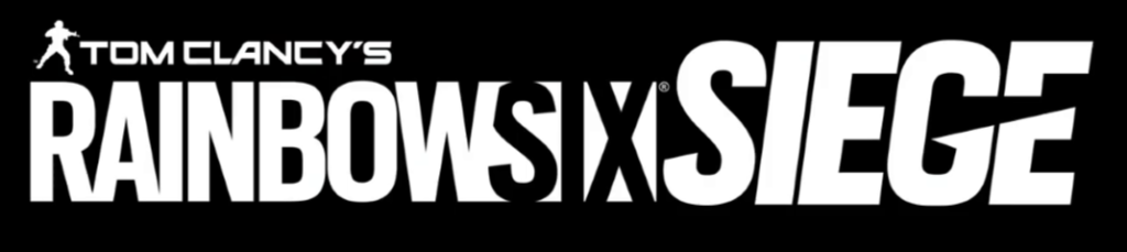
The original Rainbow Six Siege logo boasts a white, sans-serif font set against a black background. While this stark contrast is typical for the genre, it doesn’t provide the logo with the uniqueness and character it deserves. The composition, with its uninspired design, falls short of conveying the essence of tactical warfare and counter-terrorism that the game embodies.
One of the most glaring issues with the original logo was the word six. The six, part of the title, was challenging to decipher due to its distorted, fragmented appearance. This rendered the title less legible, a critical flaw in logo design.
How to improve:
To enhance the logo’s visual impact, i began by changing the font to a more military-inspired, sans-serif typeface. This alteration immediately lends a sense of authority and seriousness, reinforcing the game’s themes.
The most significant alteration was the transformation of the ‘w’ in the word “Rainbow” into the Roman numerals for six, VI. I integrated the VI into the W, giving it a scratched gold texture to make it stand out from the rest of the letters. This visual metaphor cleverly ties the game’s title to its core concept: teamwork, tactics, and the thrill of the sixth installment in the series.
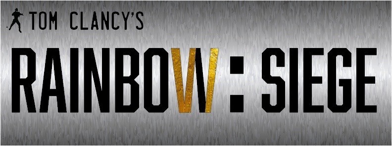
Added Readability:
Next, i opted for a brushed steel background. The metallic texture not only adds personality to the logo but also serves to make the black text pop more prominently. The juxtaposition of the dark text against the metallic backdrop not only creates a stronger visual contrast but also gives the emblem a unique industrial edge that aligns with the game’s tactical aesthetics.
“While white text on a black background provides very high value contrast, it is less readable and causes greater eye fatigue than black text on a white background.” (https://www.uxmatters.com/mt/archives/2007/01/applying-color-theory-to-digital-displays.php#:~:text=the%20best%20contrast.-,While%20white%20text%20on%20a%20black%20background%20provides%20very%20high,dark%20backgrounds%20causes%20eye%20fatigue.)
Conclusion:
In conclusion, the revamped Rainbow Six Siege logo successfully addresses the original composition issues by employing a new font, a brushed steel background, and a creative VI integration. These adjustments not only improve the logo’s visual appeal but also establish a deeper connection with the game’s themes and overall experience. The result is a logo that captures the spirit of tactical warfare and counter-terrorism, while being more eye-catching and memorable.