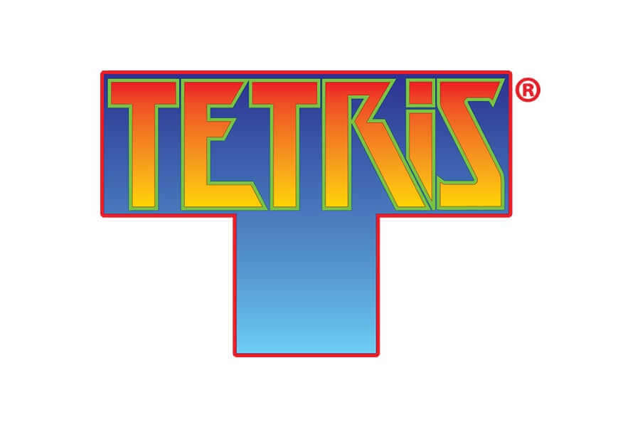
In the world of classic video games, Tetris stands tall as a timeless icon, celebrated for its addictive gameplay and enduring appeal. Beyond its gameplay, the Tetris logo serves as a testament to the power of colour theory in graphic design. Crafted with precision, the Tetris logo showcases a brilliant application of colour that enhances its visual impact and reinforces the game’s universal appeal.
Effective use of Complimentary Colours:
The Tetris logo ingeniously employs a vibrant colour palette consisting of bright orange and deep blue hues. These colours are strategically chosen to create a strong contrast, ensuring high visibility and readability. Orange, a colour associated with energy and enthusiasm, infuses the logo with a sense of excitement and dynamism, mirroring the fast-paced nature of the game. In contrast, the deep blue background not only provides a calming backdrop but also accentuates the vividness of the orange lettering.
https://tetris.wiki/Tetris_logo
The use of complementary colours – orange and blue – enhances the logo’s overall harmony. Complementary colours, found opposite each other on the colour wheel, create a striking contrast and make each other stand out. In the Tetris logo, the warm tones of orange pop against the cool blue background, instantly drawing the viewer’s attention.
Simplicity Wins:
The genius of the Tetris logo lies not just in its colour choice, but also in its universal appeal. By opting for bold, clear typography and a minimalistic design, the logo transcends language barriers and cultural differences, making it instantly recognizable to players across the globe. The Tetris logo teaches a valuable lesson: effective use of colour theory combined with a minimalist approach can create a logo that not only stands the test of time but also becomes an enduring symbol in the gaming industry. It serves as a shining example of how thoughtful colour selection and design simplicity can leave a lasting impact on players, making the Tetris logo a true masterpiece in the world of game branding.
https://www.pngwing.com/en/search?q=tetris+Online+Inc
Conclusion:
In conclusion, the Tetris logo is a stellar example of how colour theory can elevate a game’s visual identity. Through the strategic use of complementary colours, namely orange and blue, the logo achieves a perfect balance between energy and calmness, capturing the essence of the game and leaving a lasting impression on players worldwide. Its timeless design continues to inspire graphic designers, highlighting the enduring importance of colour theory in logo creation.
Bad Example:
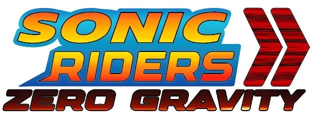
In the world of video games, a logo serves as the gateway to the adventure that lies within, giving players a glimpse of the excitement awaiting them. However, not all logos manage to capture the essence of the game effectively. One such example was the original logo for “Sonic Riders: Zero Gravity.” Despite the promise of high-speed action and thrilling races, the logo failed to convey this excitement.

The issues with the original design were apparent with its mismatched colour scheme, especially the bright green used in the words “Zero Gravity.” This vibrant shade clashed with Sonic’s high-energy persona and disrupted the overall harmony of the design.
https://logos.fandom.com/wiki/Sonic_Riders:_Zero_Gravity
Colour Unification:
To address these concerns and breathe new life into the logo, deliberate changes were made. The first significant change involved unifying the colours in the logo. The word “Riders” was transformed to match the vibrant yellow-orange gradient present in the word “Sonic.” This seemingly simple change played a pivotal role in bringing cohesiveness to the design, reinforcing the visual identity of the Sonic brand.
Additionally, the bright green in “Zero Gravity” was replaced with a dynamic gradient transitioning from black to red to yellow. This shift not only captured the essence of high-speed racing but also added a sense of excitement and visual appeal to the logo, aligning it more closely with the game’s theme.
Thematic Consistency:
Furthermore, the arrows in the logo received a fresh, stylized texture, enhancing the overall aesthetic while maintaining the logo’s established speed and dynamism. This texture introduced depth and character to the emblem, making it visually engaging and memorable.
Conclusion:
In conclusion, these thoughtful changes transformed the “Sonic Riders: Zero Gravity” logo into a visually cohesive and thematically aligned design. The revamped logo now conveys the high-speed thrills and energy of the game, promising players an exhilarating adventure from the moment they lay eyes on it, whilst still abiding by the set colour scheme. It stands as a testament to how strategic changes can elevate a lackluster design into an emblem that truly resonates with its audience.